Chapter 3: Staging Techniques and Strategies
IN THIS LESSON
"In visual perception, a color is almost never seen as it really is—as it physically is. This fact makes color the most relative medium in art", Josef Albers
Welcome to Lesson 1 of Module 3: Staging Techniques and Strategies< Choosing the Right Colors. This lesson is an integral part of our comprehensive course tailored specifically for home sellers. Our goal is to equip you with the skills necessary to stage your home effectively, enhancing its appeal and marketability to potential buyers.
In this lesson, we delve into the art of selecting the right colors and textures that resonate with buyers.

Understanding color psychology and texture dynamics is crucial in creating an inviting and attractive environment that can lead to faster sales and higher offers.
Why Colors and Textures Matter
Colors and textures are powerful tools in home staging. They can evoke emotions, create illusions of space, and highlight the best features of your home. By choosing the right palette and materials, you can transform a space into a welcoming haven that appeals to a wide range of buyers.
Key Takeaways from This Lesson
Understanding Color Psychology: Learn how different colors can influence mood and perception. Discover which hues are most likely to attract buyers and how to use them effectively in your home.
Texture Dynamics: Explore how various textures can add depth and interest to a space. Find out how to combine textures to create a balanced and harmonious environment.
Creating Cohesion: Master the art of creating a cohesive look throughout your home by selecting complementary colors and textures that flow seamlessly from room to room.
Practical Application: Gain practical tips on how to apply these concepts in your own home, with real-life examples and case studies.
By the end of this lesson, you will have a solid understanding of how to choose colors and textures that not only enhance the aesthetic appeal of your home but also increase its marketability. Join us as we explore the transformative power of thoughtful staging techniques.
Trivia Tidbit -
Color is a big world! You can easily get lost in the vast ephemeral world of color, not knowing where to start.
Color theory has evolved over thousands of years, beginning with ancient ideas about light and darkness.
Early thinkers like Aristotle connected colors to basic elements and the concepts of light and dark. In the 17th century, Isaac Newton's experiments with prisms showed that white light is made up of a spectrum of colors, which was groundbreaking.
Later, Goethe explored how colors affect our emotions, and the creation of the color wheel helped us understand how colors relate to each other and influence our perception.
The history of color is more than a simple timeline. It's a vibrant tapestry woven with scientific discovery, cultural beliefs, artistic expression, and the intriguing nuances of human perception. It's a field ripe for exploration and, indeed, inviting to "nerd out" over. But that's for another moment. Maybe we'll join in that fun exploration at a later time!

The Quiet Language of Stone and Leaf
Action: Find Your Palette
To find your palette, you must listen with more than your ears. It begins inside, with the silent story of your home's own skin. Run a hand along a sun-warmed wooden floorboard, feeling its patient grain. See how the light, pouring through the glass, can soften a shadow into a wash of cool gray. This is your foundation—the tactile and visual conversation your home is already having with the world.
Now, step outside with a quiet mind, and become a student of the elemental. Go to the garden, not to tend, but to feel. Let your fingers trace the rough scar of a brick, the cool smoothness of a river-stone pebble. Notice the deep, earthen browns of the soil, the muted greens of a thriving vine, the surprising russet at the heart of a fallen leaf. The colors you need are not invented, but discovered, gathered with intention from the very ground beneath your feet.
Carry these found treasures inside. The smooth weight of a stone in your palm is a kind of anchor. Hold it against the woods, the fabrics, the metals of your home. Watch how the colors touch and respond, like old friends. This quiet, sensorial ritual will teach you to see the resonant, natural palette that was always there, waiting to be collected.

In general, neutral color palettes are highly recommended for staging homes to sell because they create a broad appeal and allow potential buyers to easily visualize themselves living in the space.
By employing a thoughtful and strategic approach to color in home staging, you can create a welcoming and appealing environment that resonates positively with potential buyers and helps facilitate a successful sale.
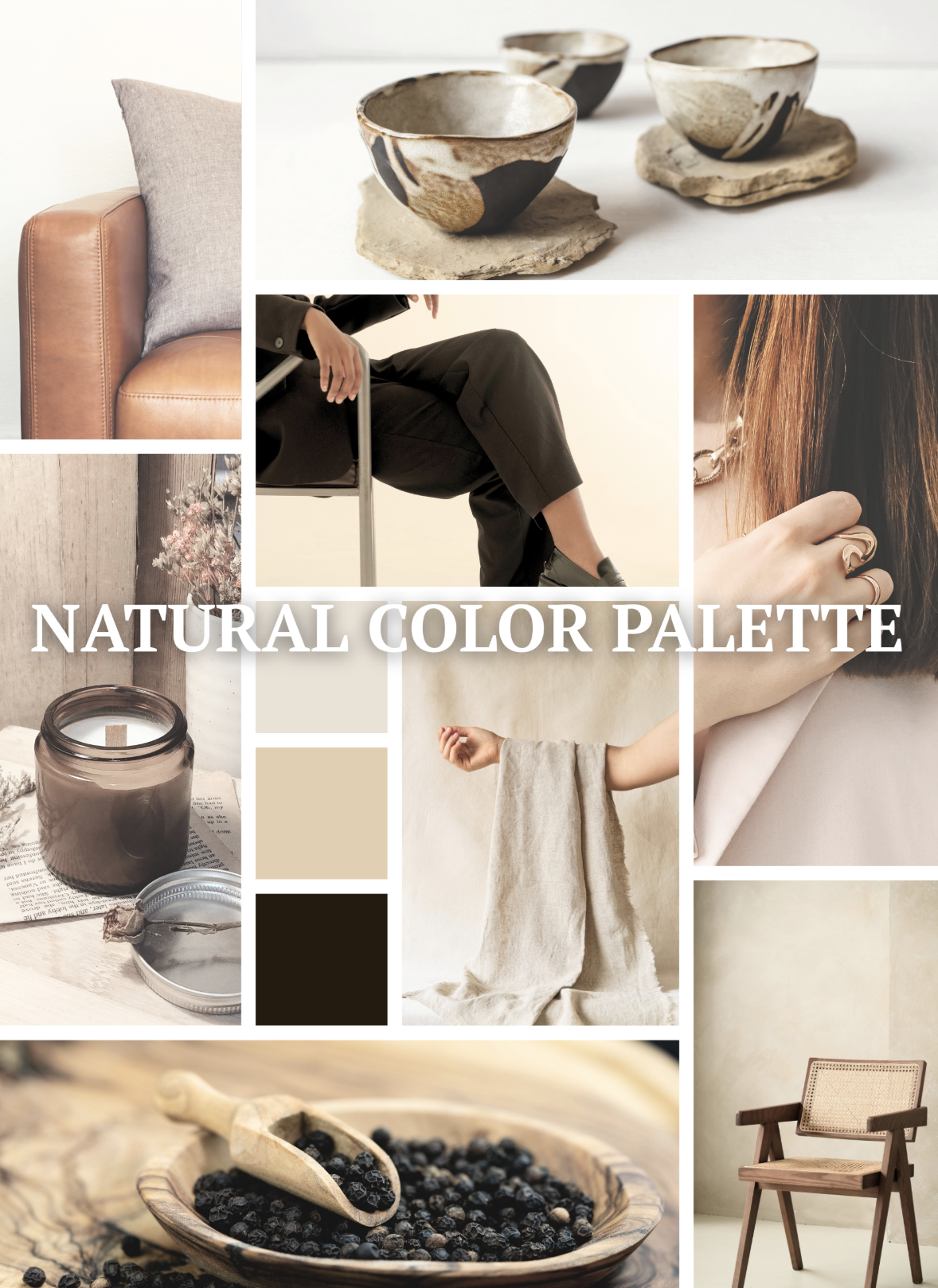
Want an elegant color palette? Here's the trick: go for neutrals with black accents. Don't worry about finding fancy paint swatches—your color inspiration is already right there in your natural materials! Take a close look at your leather, rattan, linen, stone and wood. Pick three colors from those to be your guide. Easy peasy! You got this!
You can add pops of color, for example, bringing some greenery, which adds a refreshing quality and balance.

Pick the subtle colors of your plant and add them to the range, perhaps in a cushion or some other accessories. It works beautifully. But remember, keep in simple. You are not decorating. You are staging. The idea is to not overwhelm your potential buyer with too much information: color, pattern, overcrowding the space. The Less is More idea always works!
-
Our downloads have everything you need to supplement this course.